


1
2
3
4
5
6
7
8
9
10
11
12
13
14
15
16
17
18
19

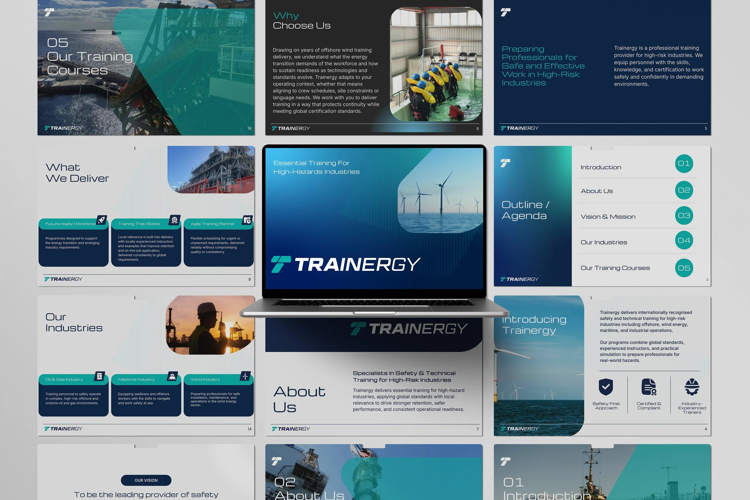
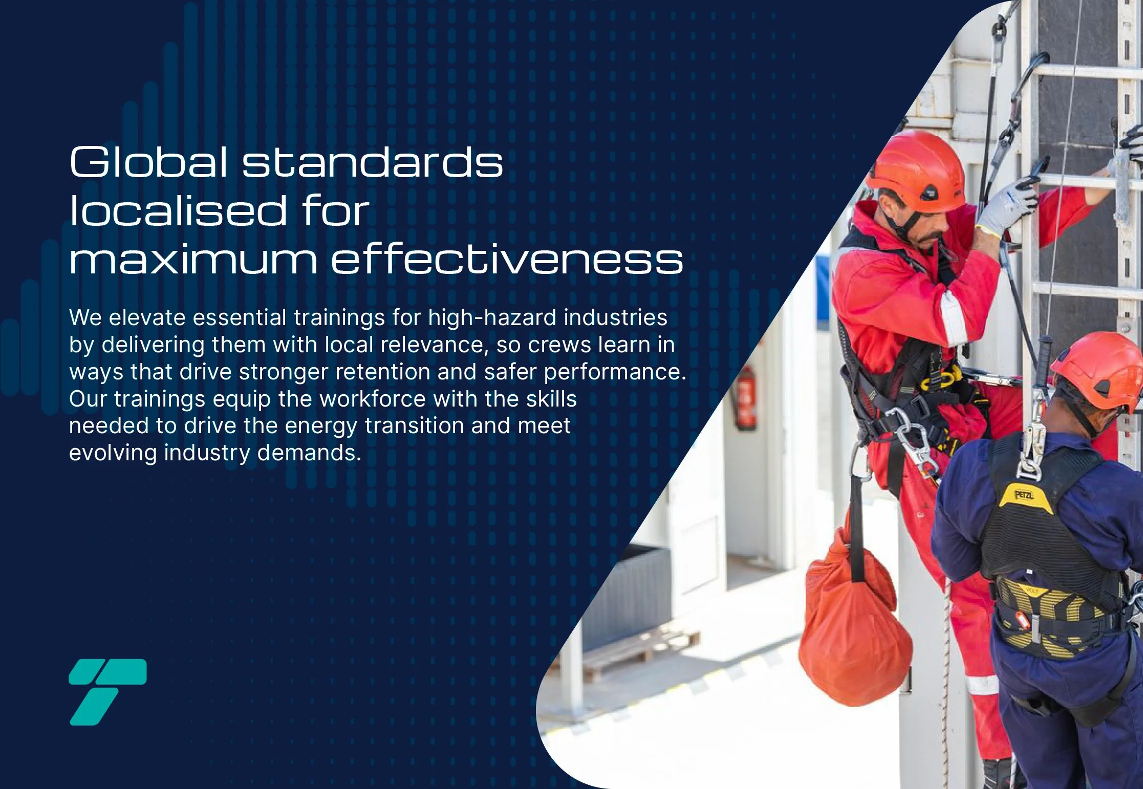
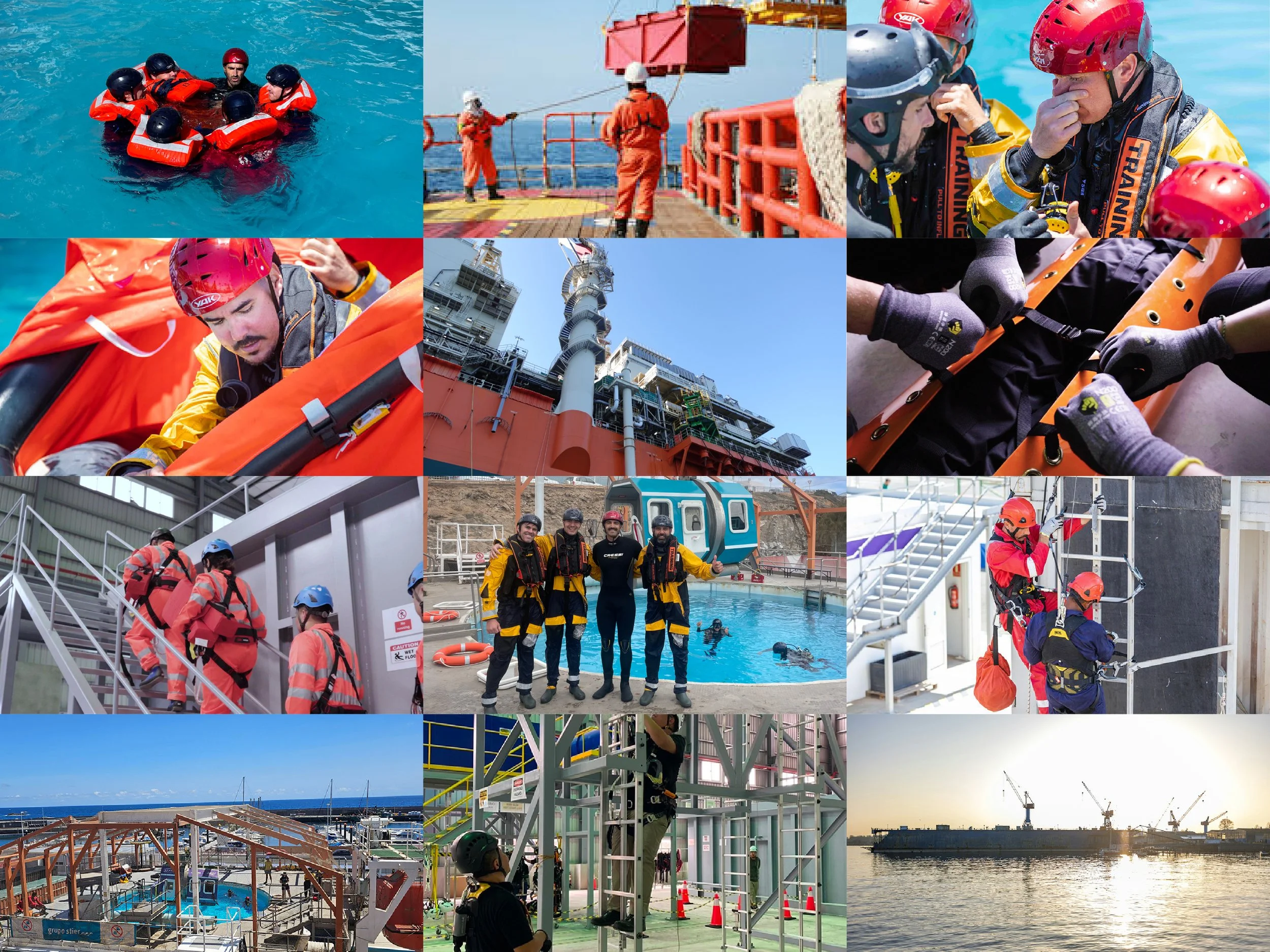
Trainergy provides global training services that ensures professionals are prepared to excel in high-risk and complex environments.
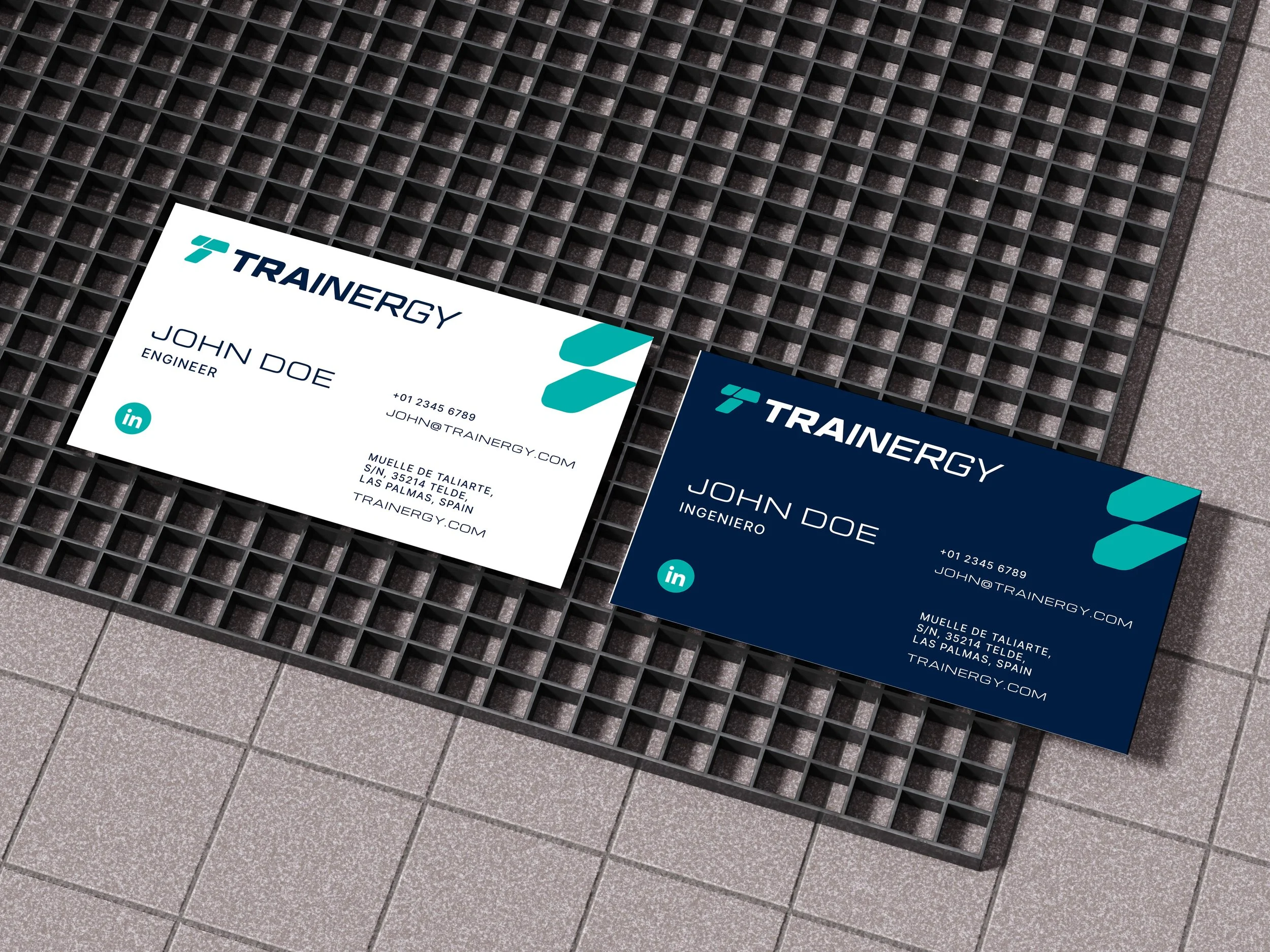
Rehla Design was responsible for the brand identity and visual design direction, ensuring a cohesive, future-ready brand experience across print, digital, and exhibition platforms.
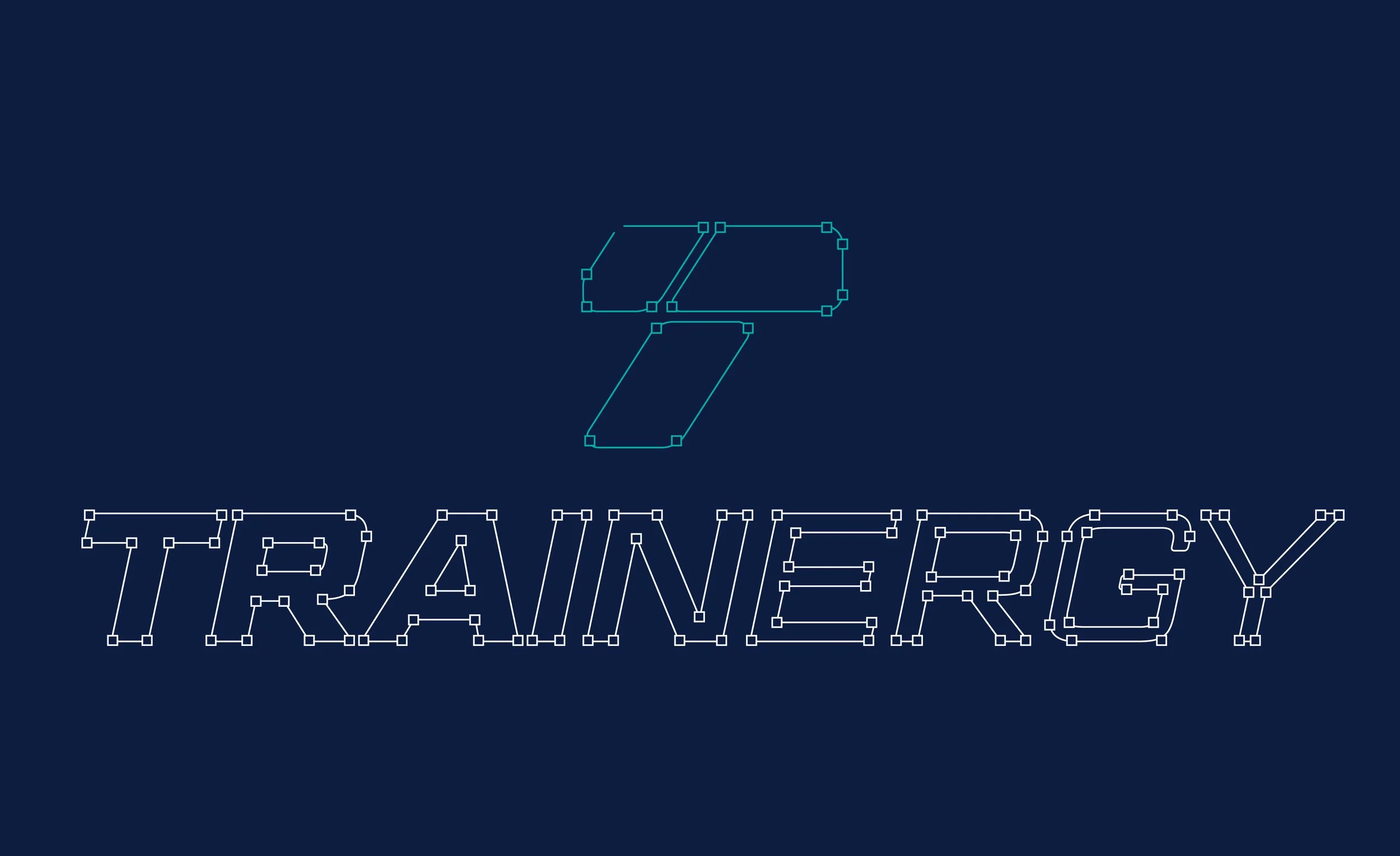
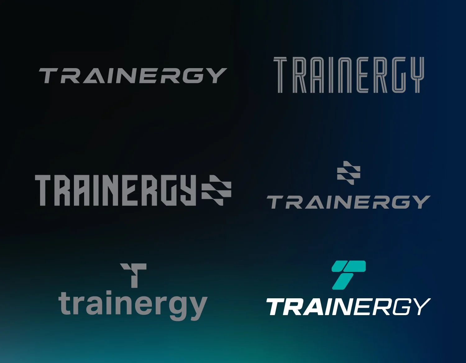
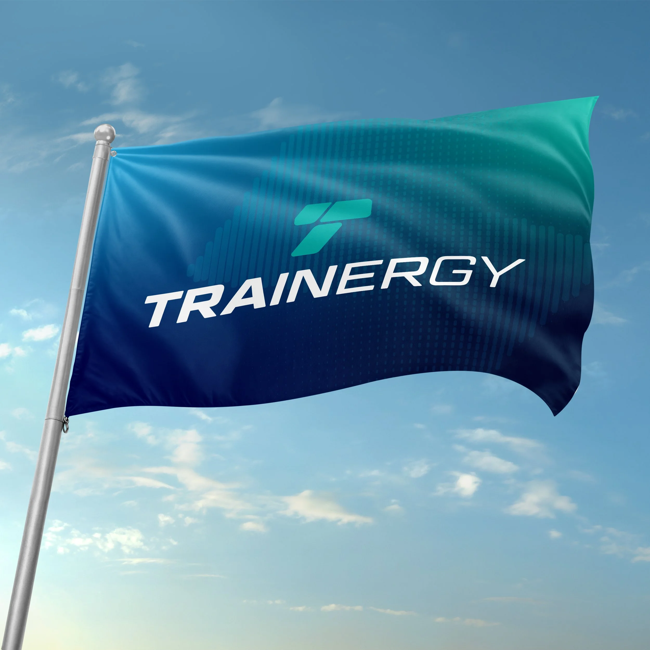
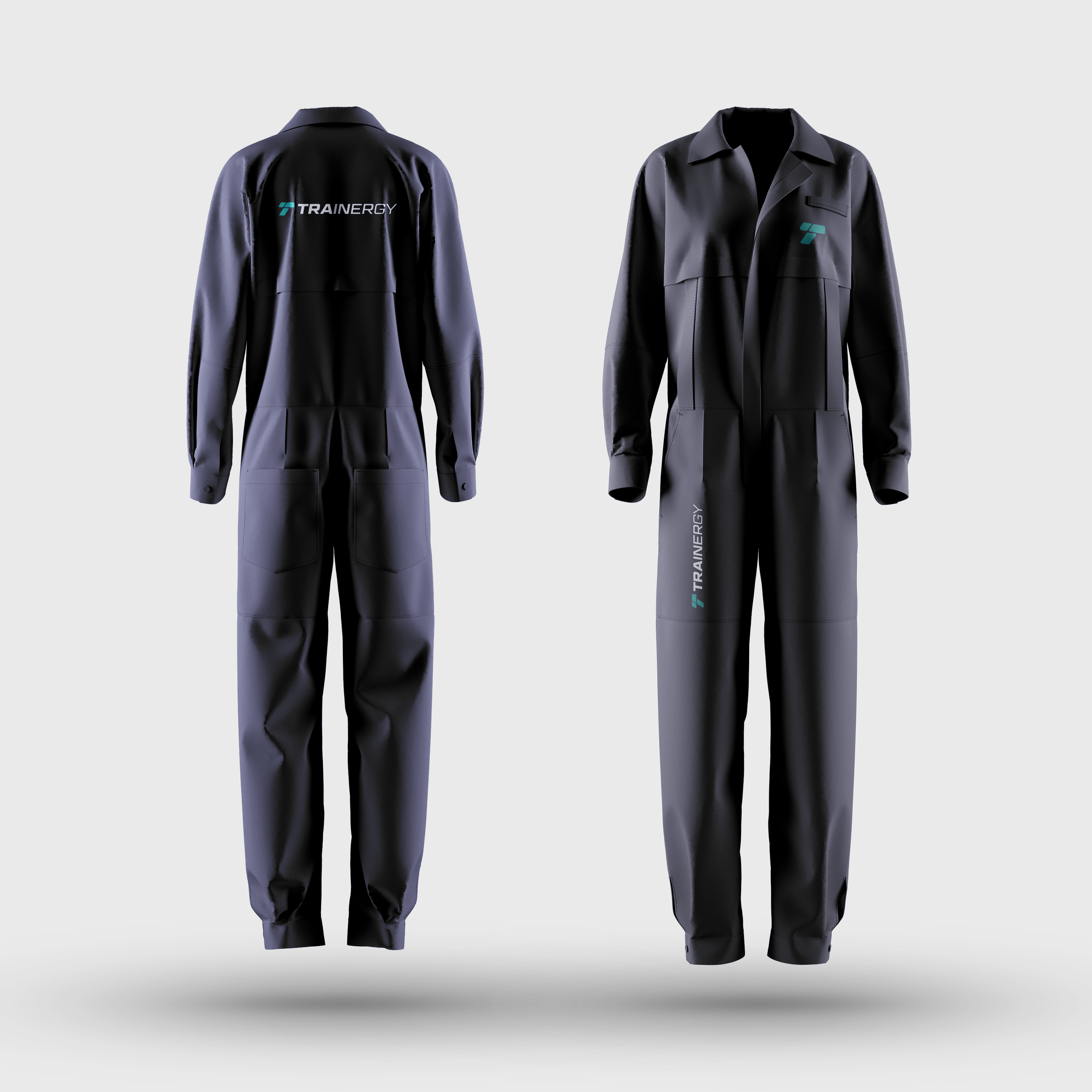
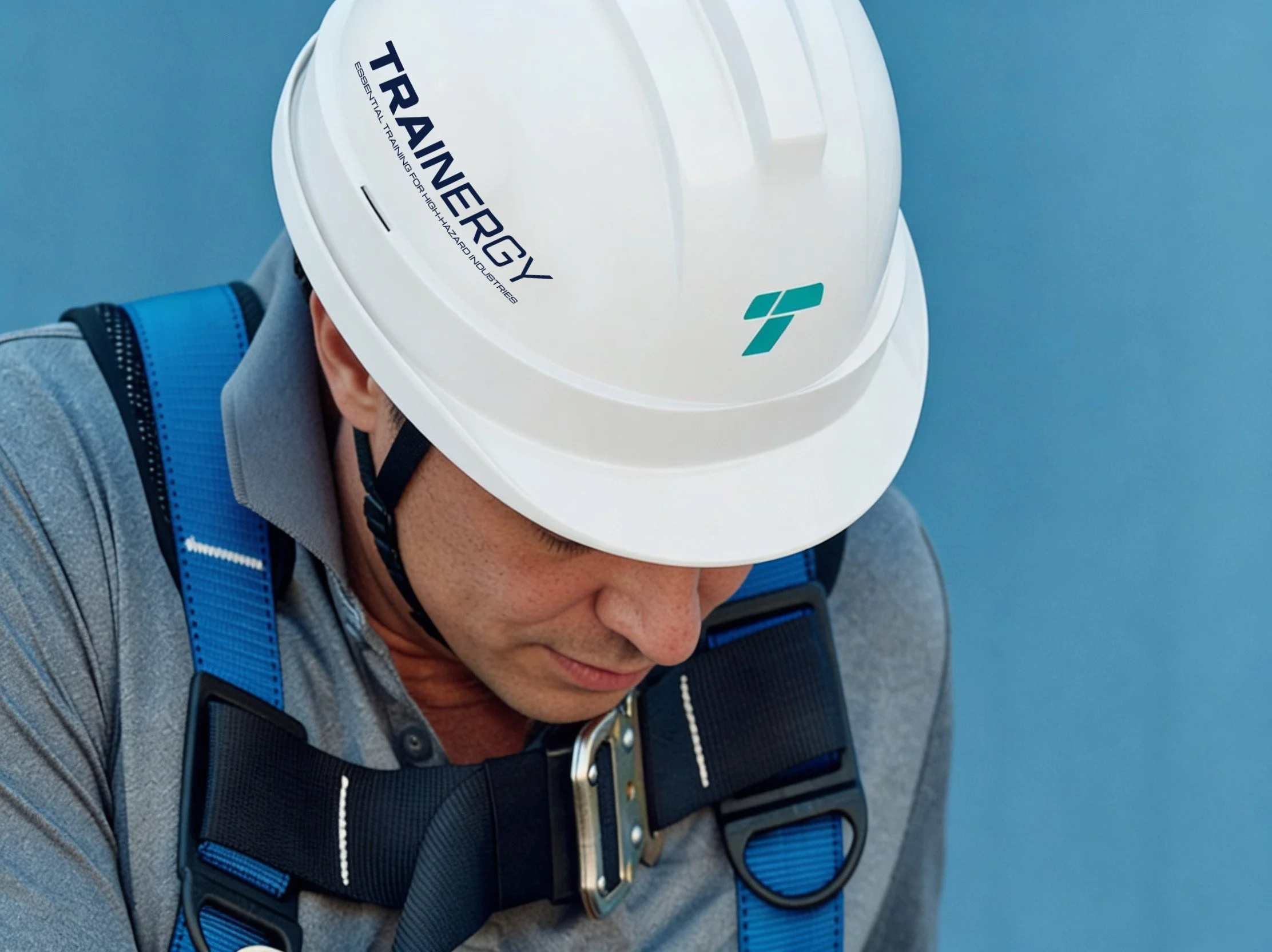
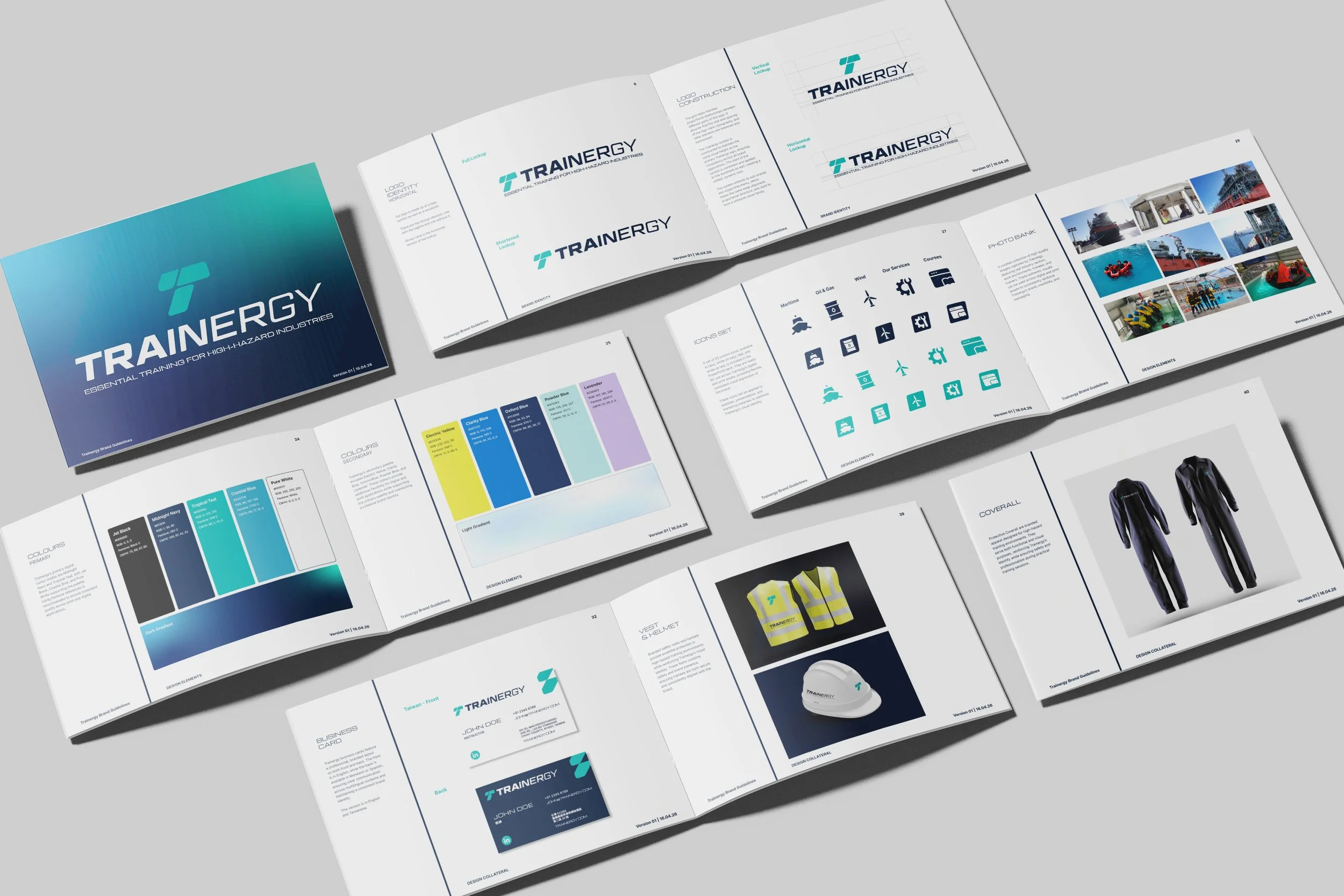
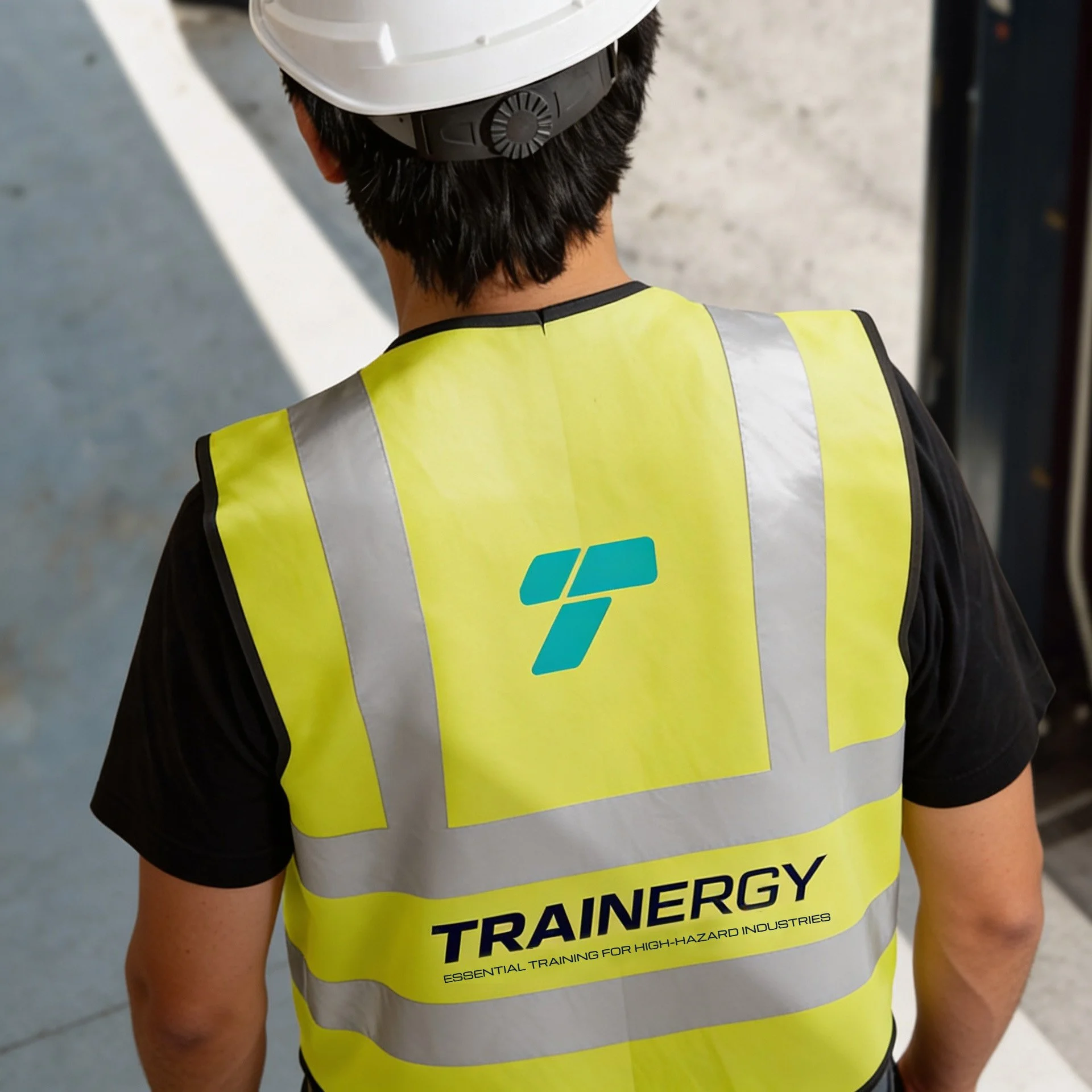
The brand identity is built around a custom symbol derived from the letter T, combining geometric shapes with smooth curves that come together to express kinetics and momentum. The wordmark features lettering that, accentuated by the gradually reduces in weight, to symbolise energy transfer. The logomark serves as the foundation of the visual system, functioning as both a standalone identifier and as a holding shape for imagery across applications.
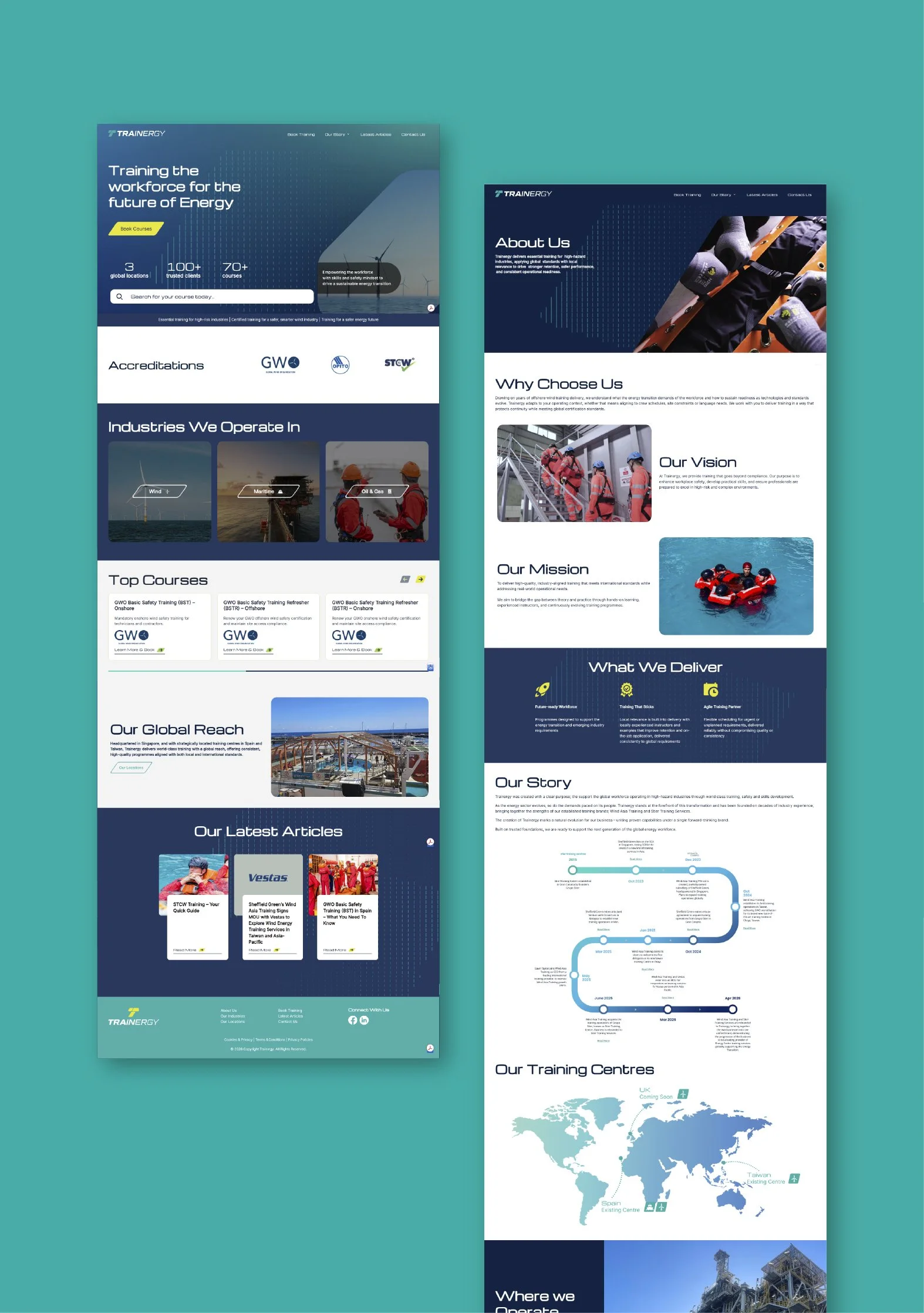
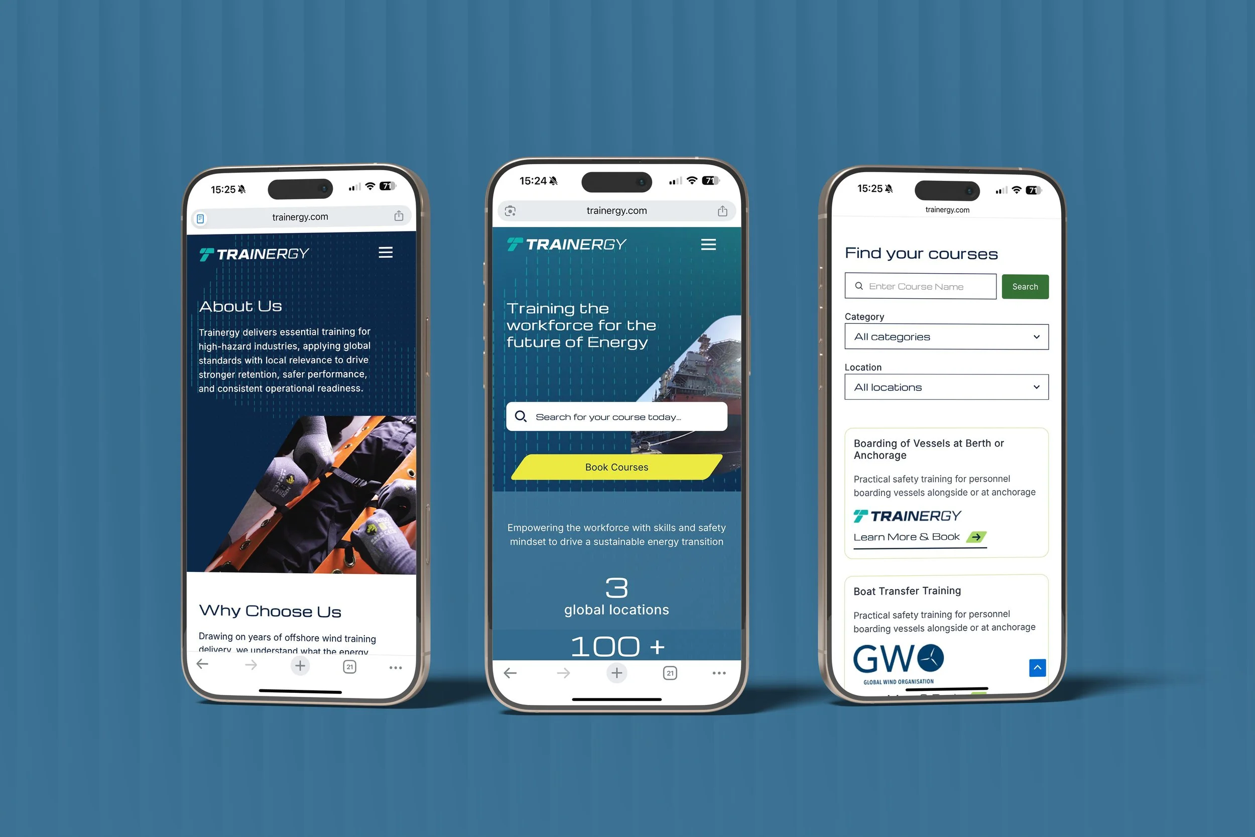
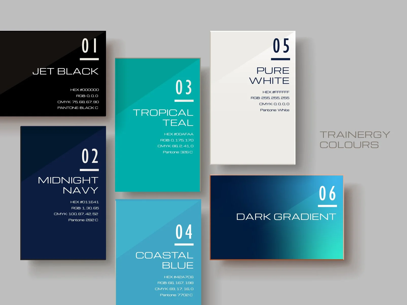
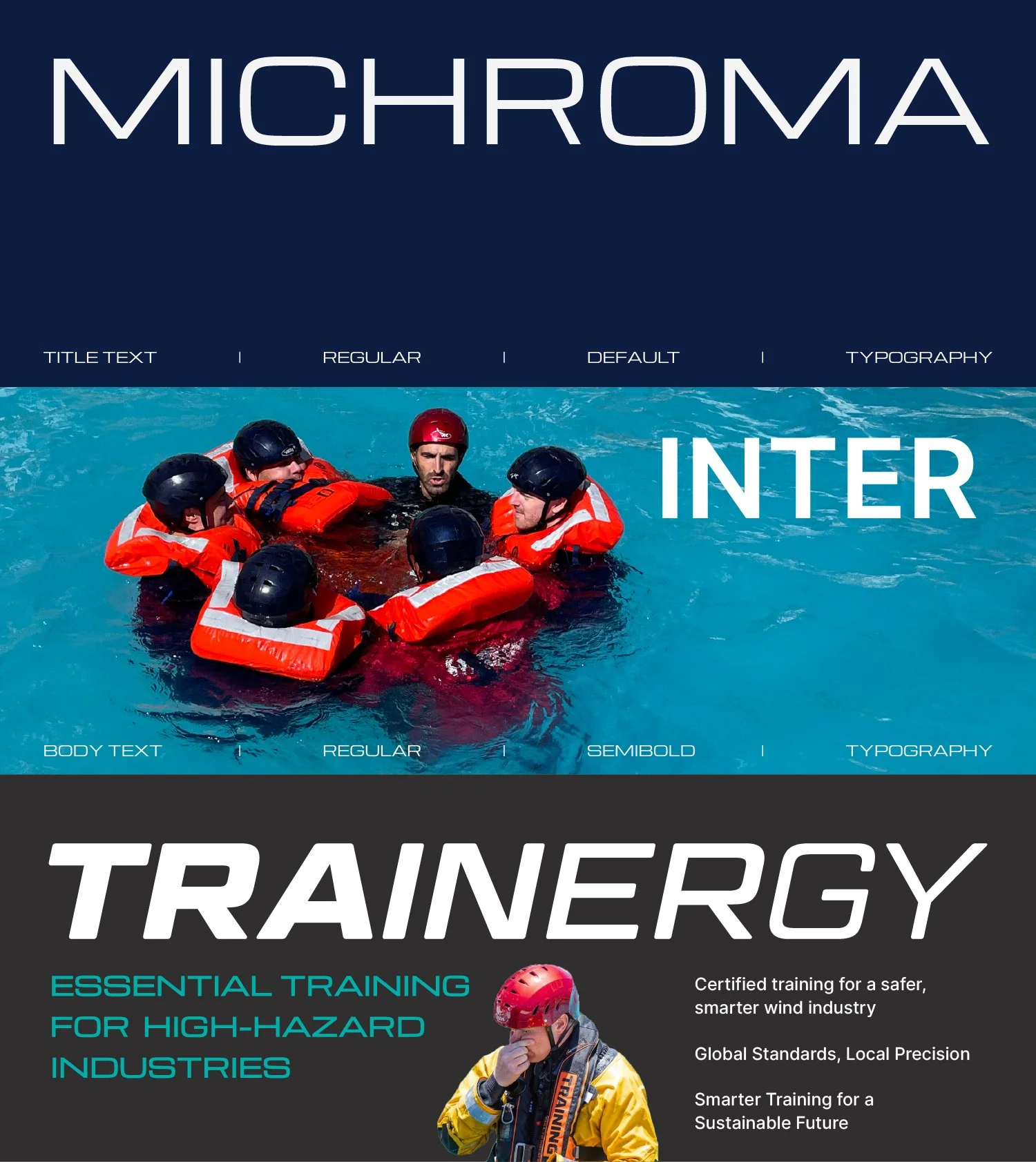
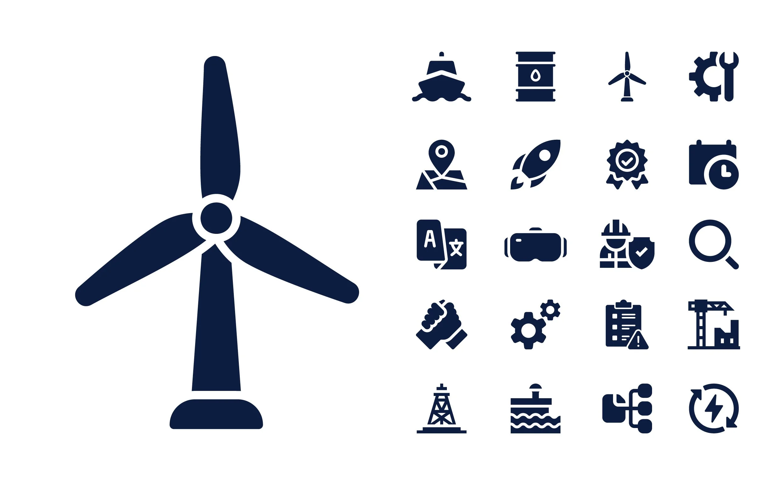
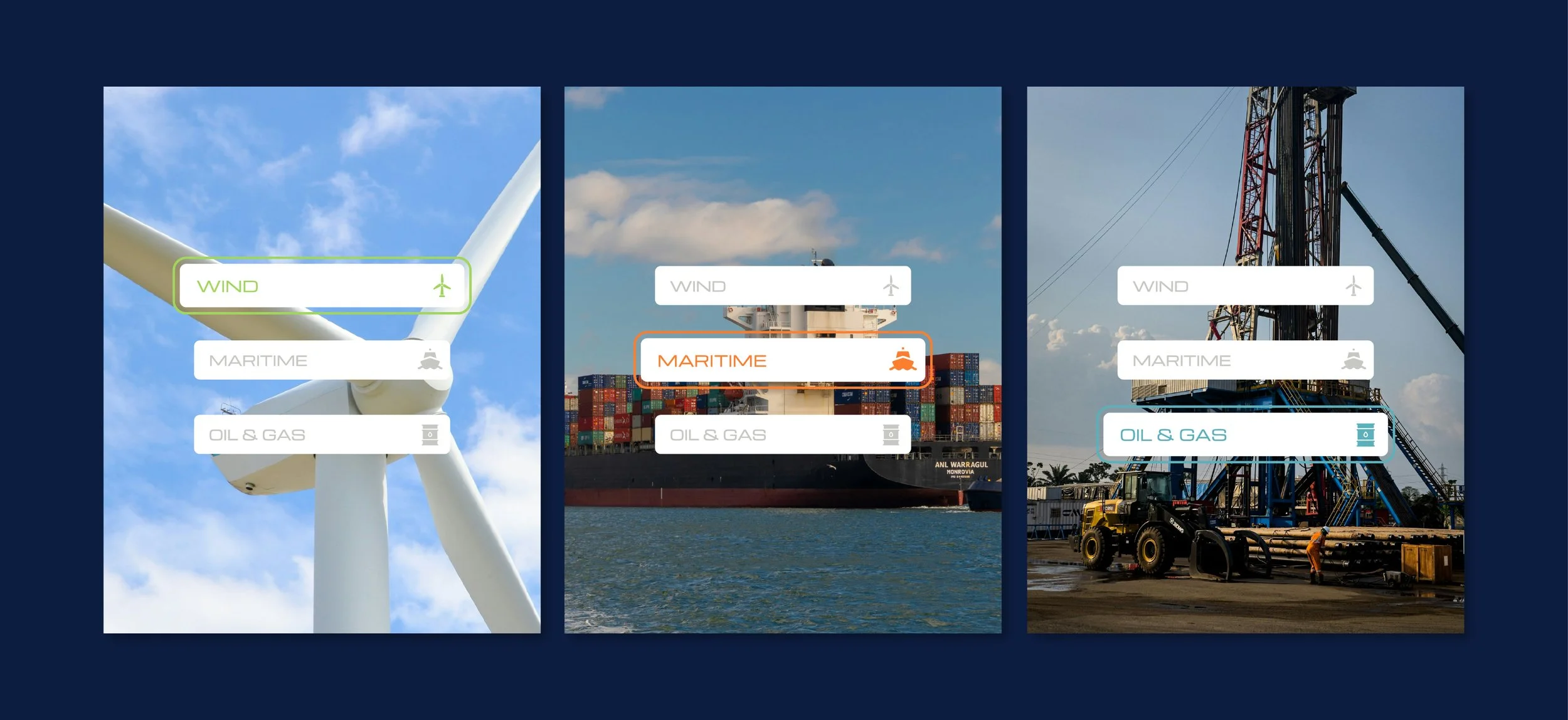
The visual language follows clean layouts, grid alignment, and sans serif font pairings to ensure clarity and professionalism. The brand palette includes a range of cool colours including teal and blues, as Trainergy's focus is centred on maritime, off-shore oil & gas and wind energy industries. A light neutral base creates openness and balance, while a vibrant yellow accent and secondary palette introduces contrast and energy, highlighting key information. Gradients and geometric forms derived from the symbol extend the system, creating a cohesive identity that feels modern, robust and built to scale.
Binomial Consulting: Strategic Planning & Brand Positioning
Rehla Design: Visual Identity Suite & Web Design
Tech StrongBox: Web Development
Accessplanit: Booking System Integration
Blinkonomics: SEO Management