




1
2
3
4
5
6
7
8
9
10
11
12
13
14
15
16
17
18
19
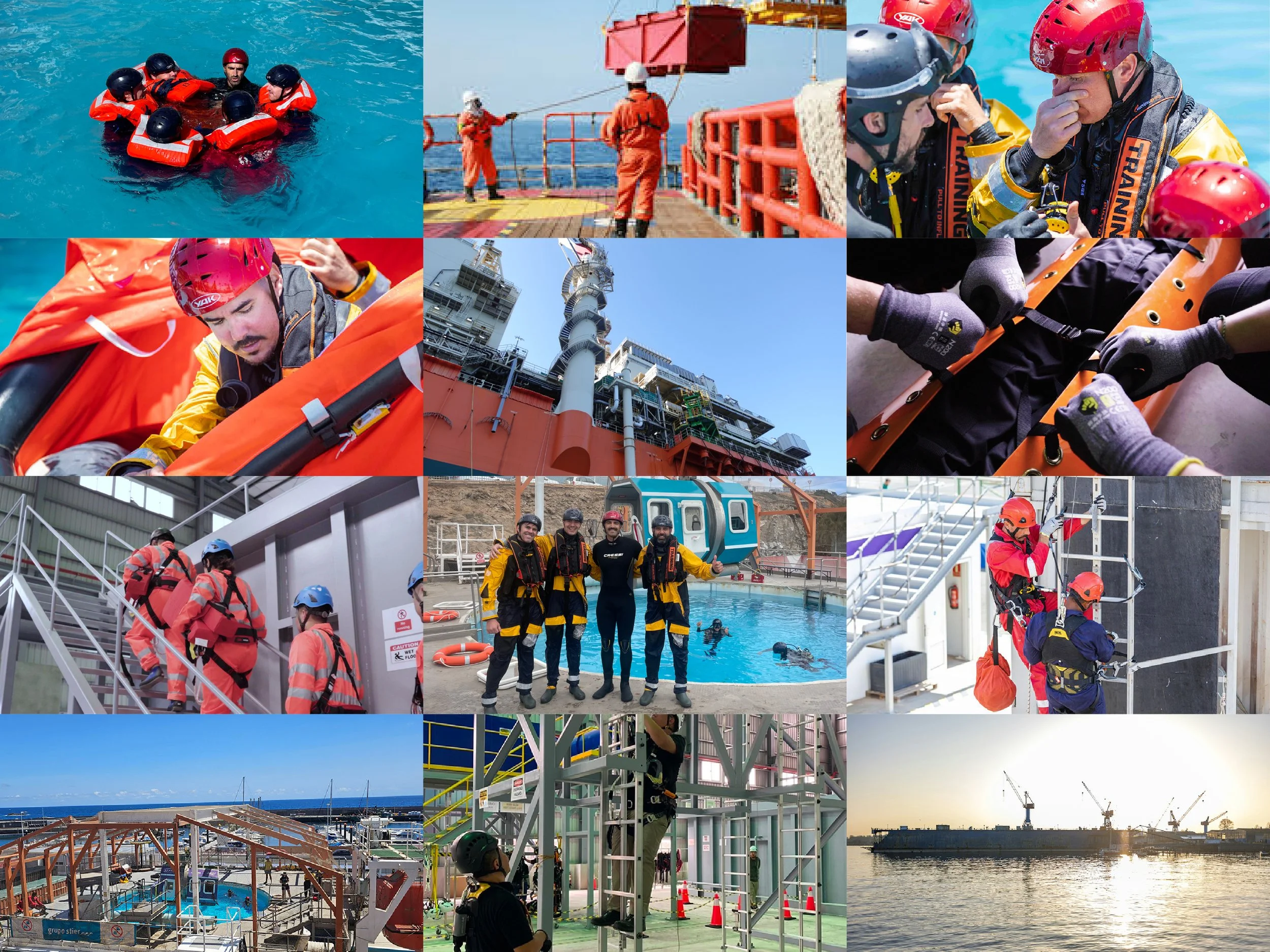
Trainergy is a global training provider specialising in preparing professionals for high-risk and complex working environments. Operating across maritime, offshore oil and gas, and wind energy sectors, the company delivers specialist training that champions safety, technical expertise and operational excellence.
Rehla Design was entrusted with developing a distinctive brand identity and visual direction that reflects Trainergy's expertise and forward-thinking approach. The objective was to create a cohesive, future-ready identity that strengthens brand recognition while maintaining consistency across print, digital and exhibition platforms.
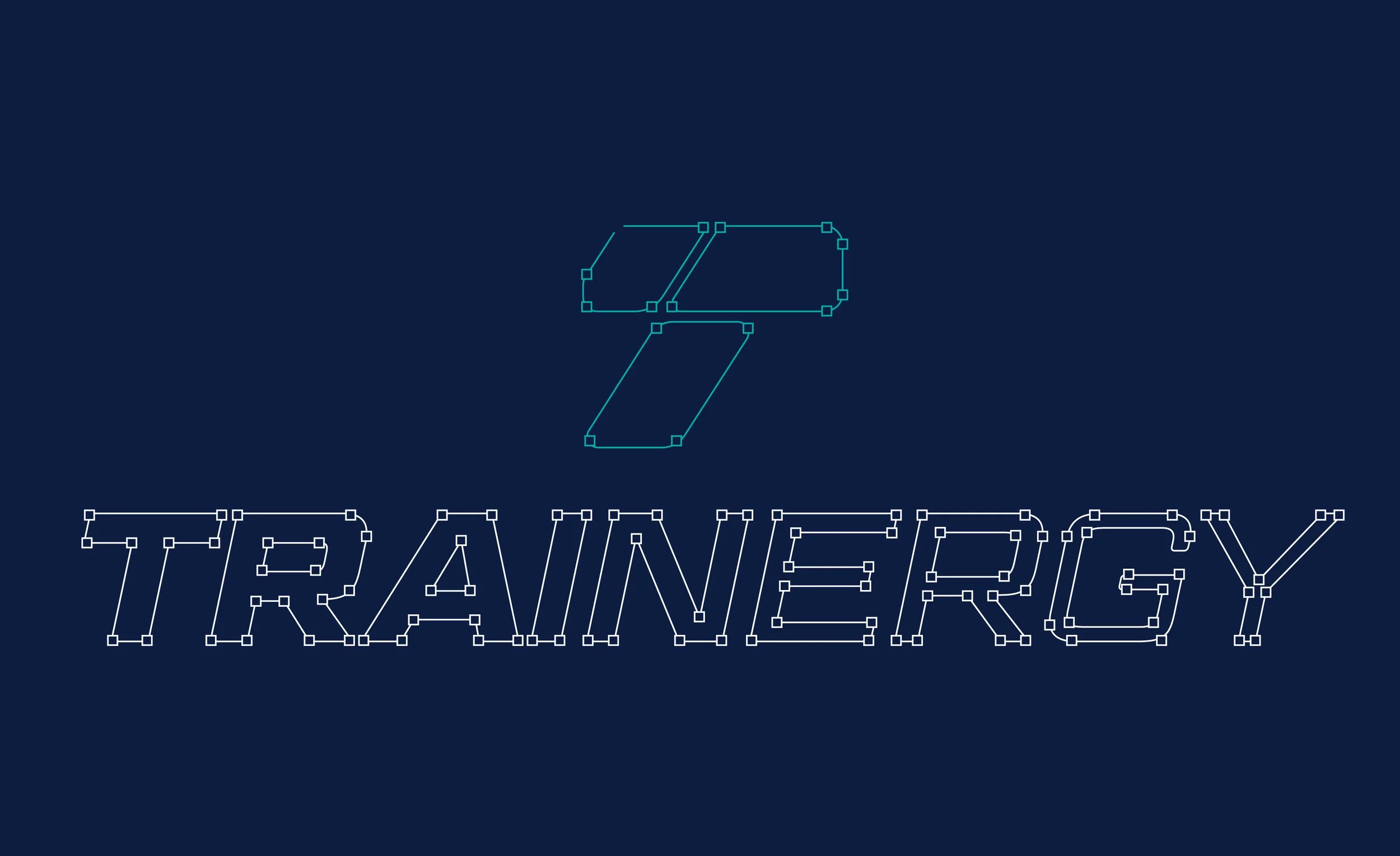
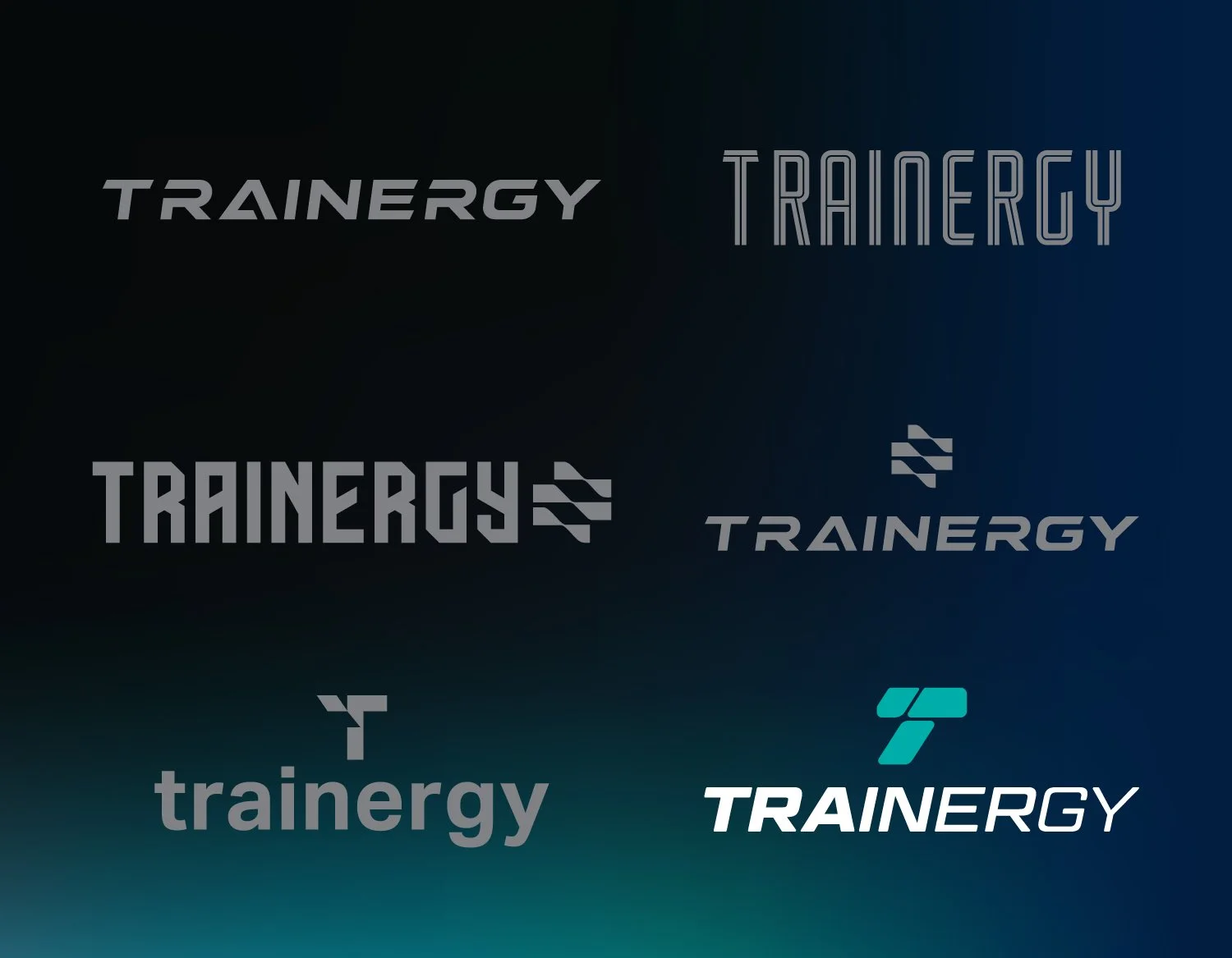
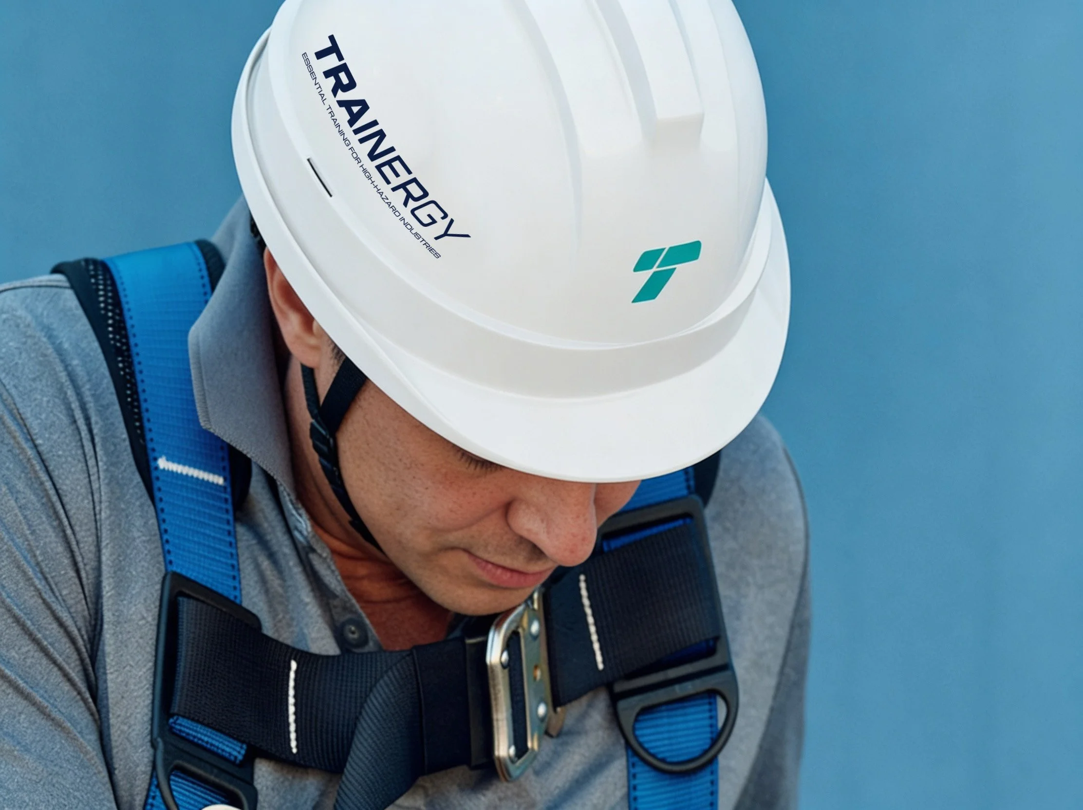
Central to the identity is a bespoke logomark inspired by the letter 'T'. Combining geometric precision with fluid curves, the symbol represents kinetics, momentum and continuous progression. The accompanying wordmark features custom lettering with a gradual reduction in weight, visually expressing the transfer of energy.
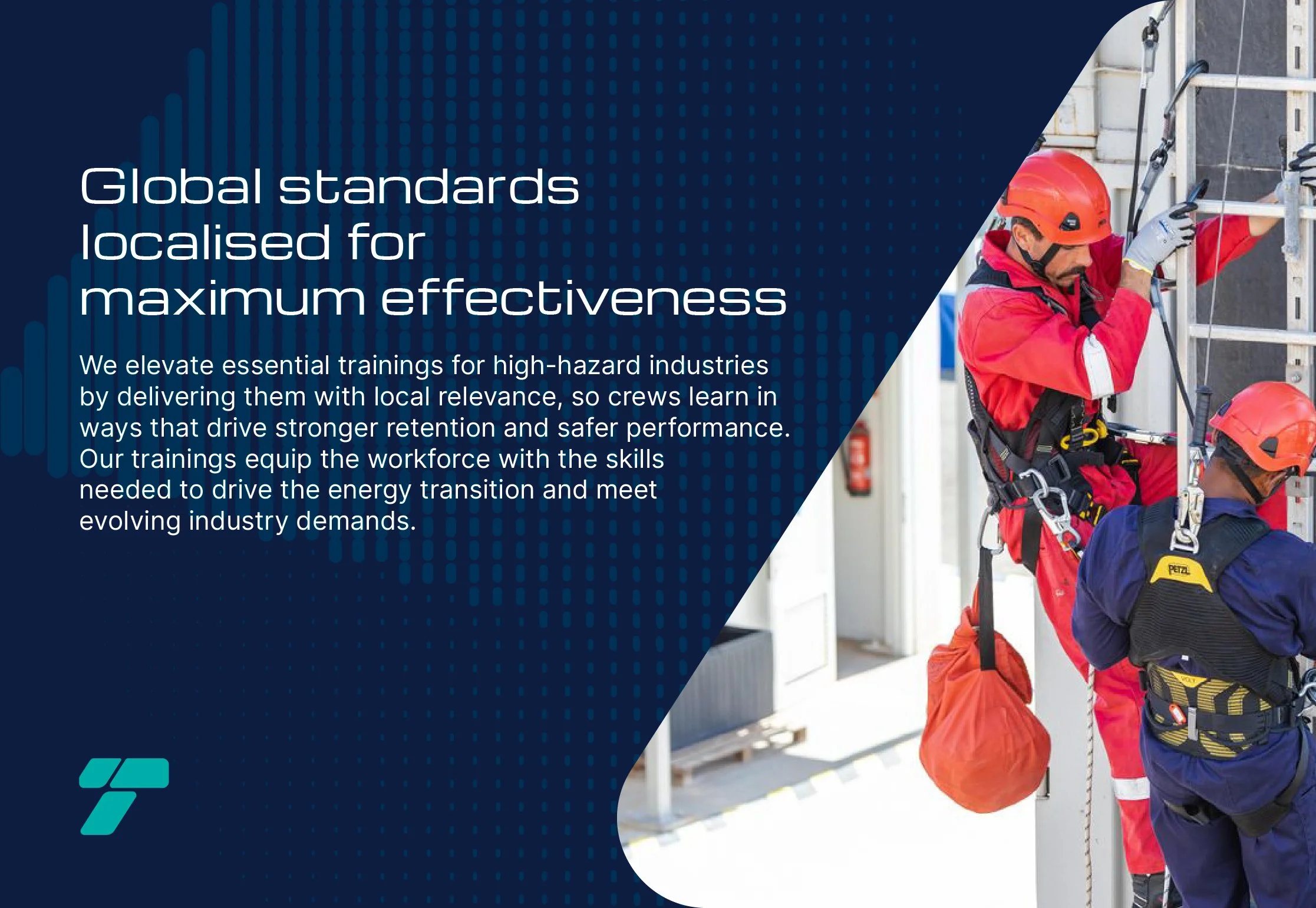
Beyond its role as a brand identifier, the logomark serves as a versatile graphic element, functioning as a standalone symbol and a framing device for imagery. This approach establishes a recognisable visual signature across different brand applications.
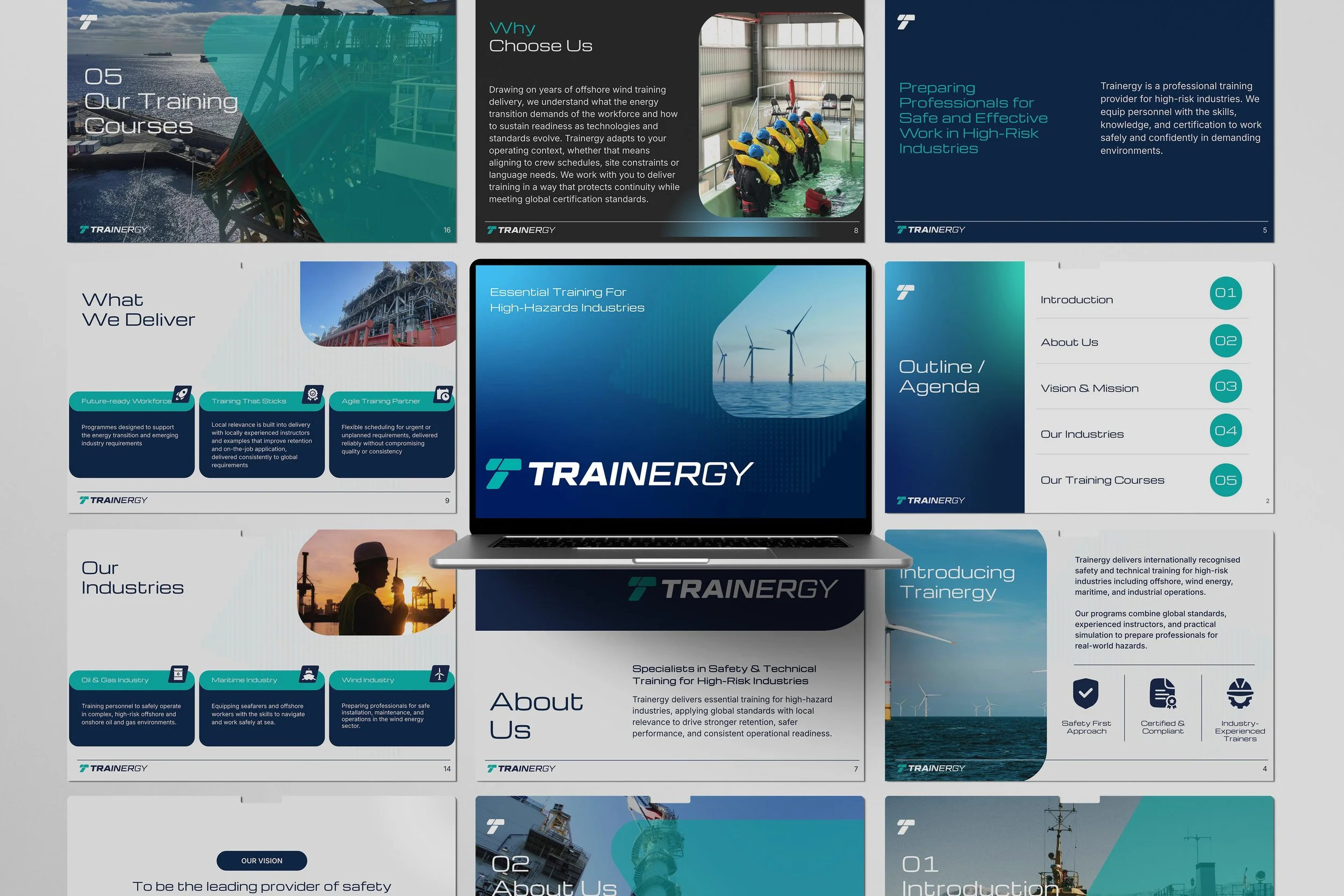
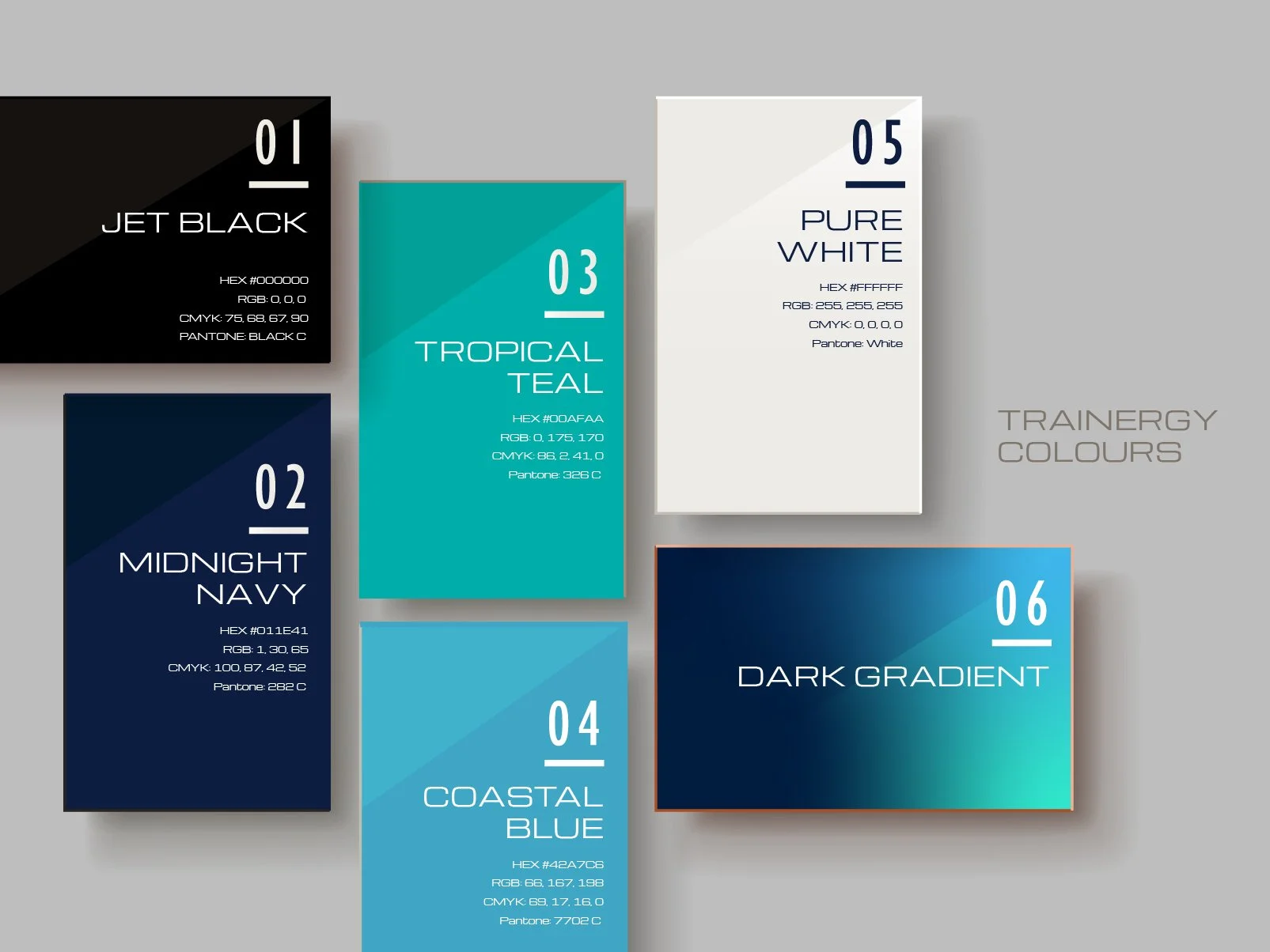
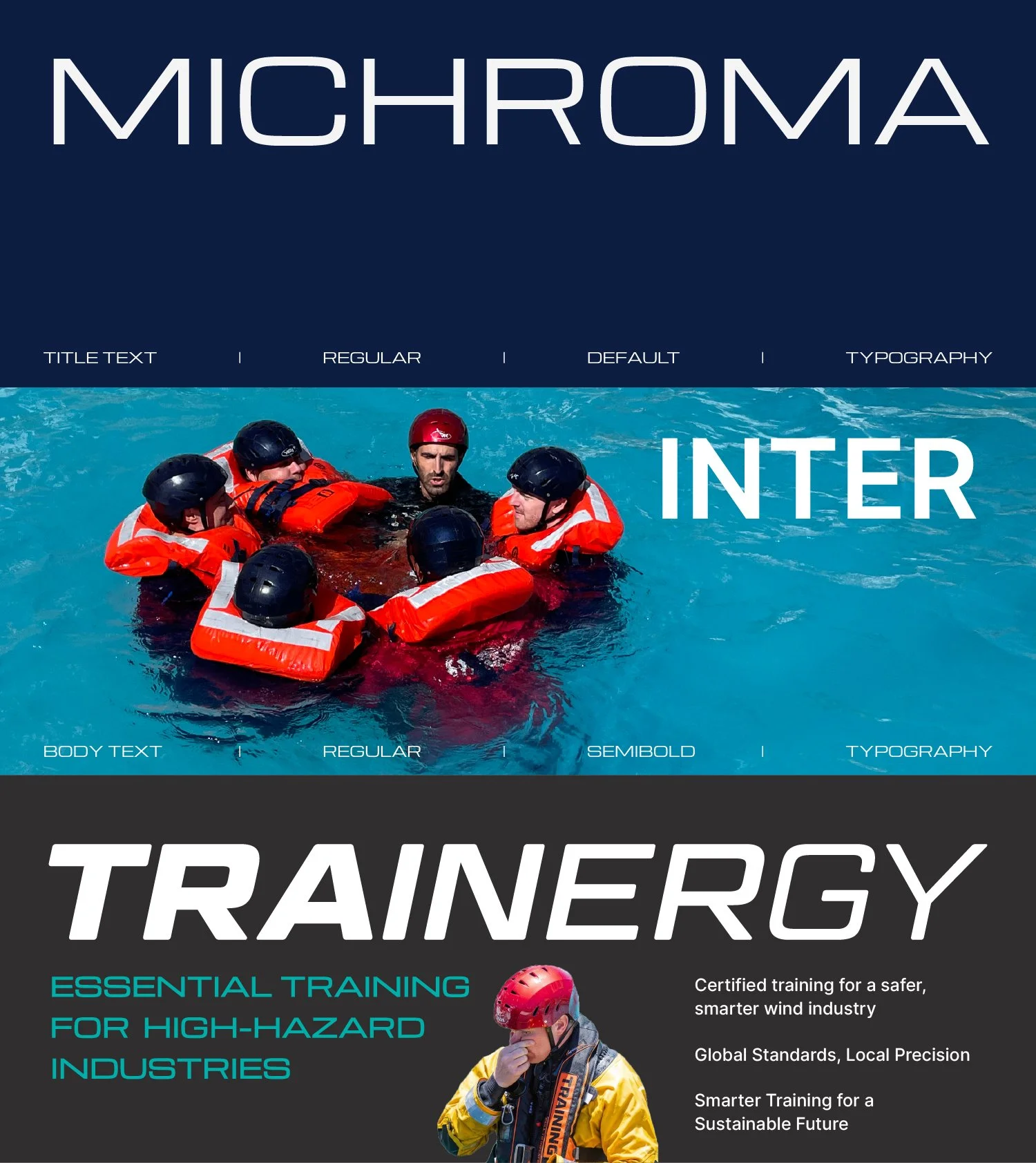
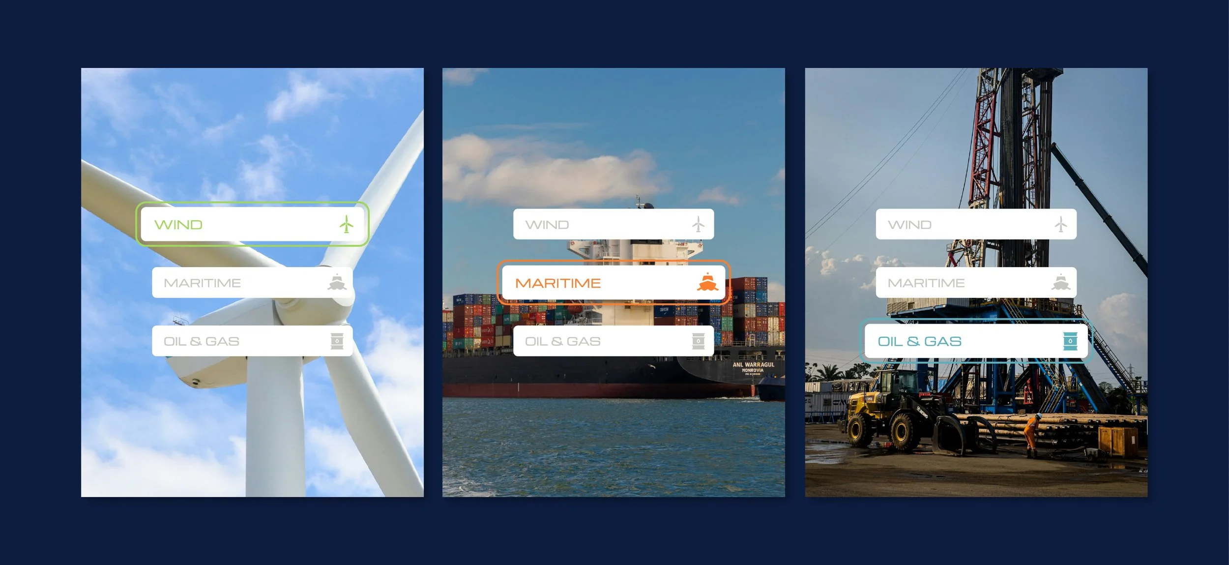
The visual identity balances clarity, structure and dynamism. Clean layouts, structured grids and contemporary sans serif typography create a professional aesthetic, ensuring information remains accessible and engaging across various touchpoints.A considered palette of deep navy, teal and cool blues reflects Trainergy's connection to maritime, offshore and renewable energy industries. Light neutral tones provide balance and openness, while vibrant yellow accents introduce contrast and highlight key information.
Gradients, geometric forms and graphic elements derived from the logomark extend the visual language, reinforcing consistency and flexibility throughout the brand system.
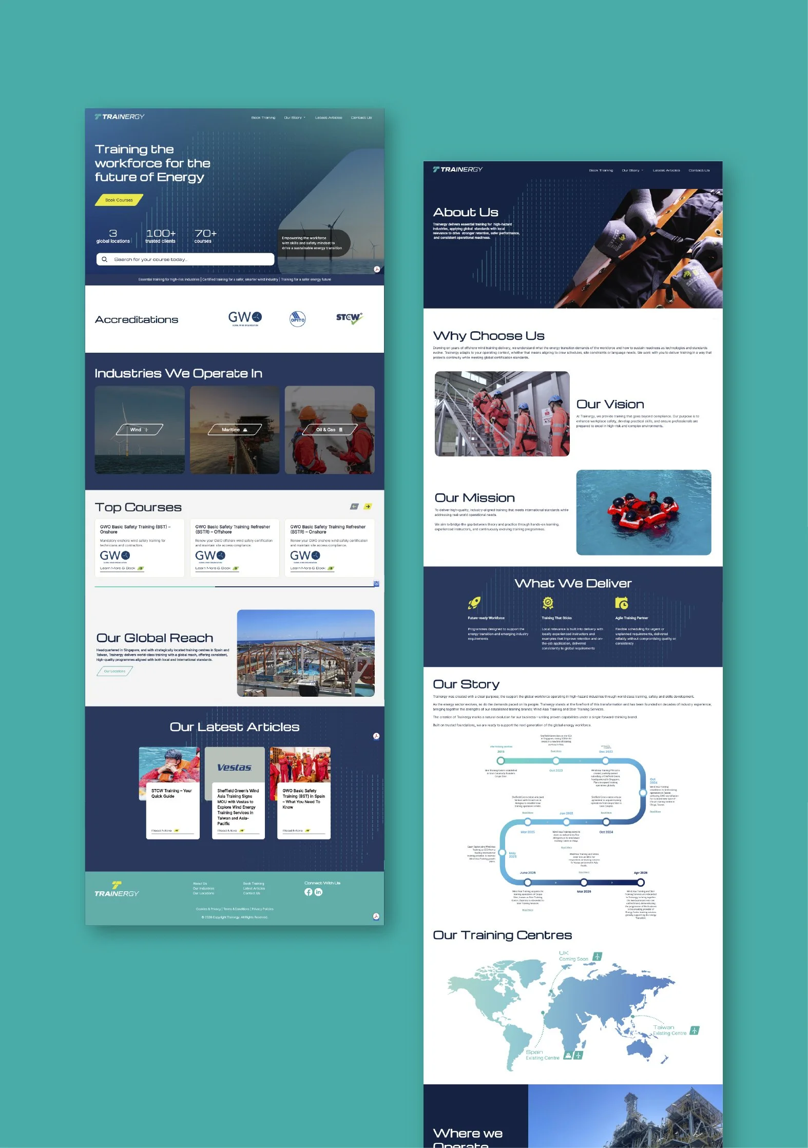
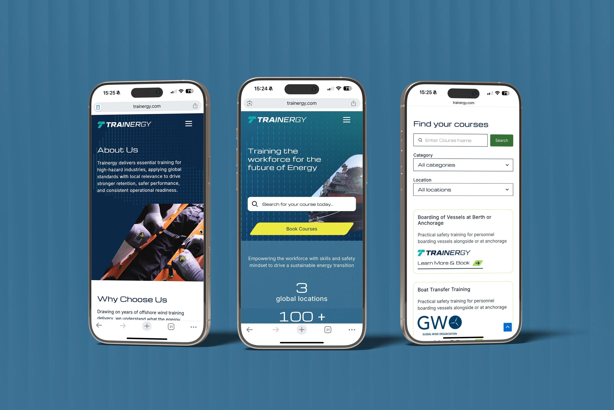
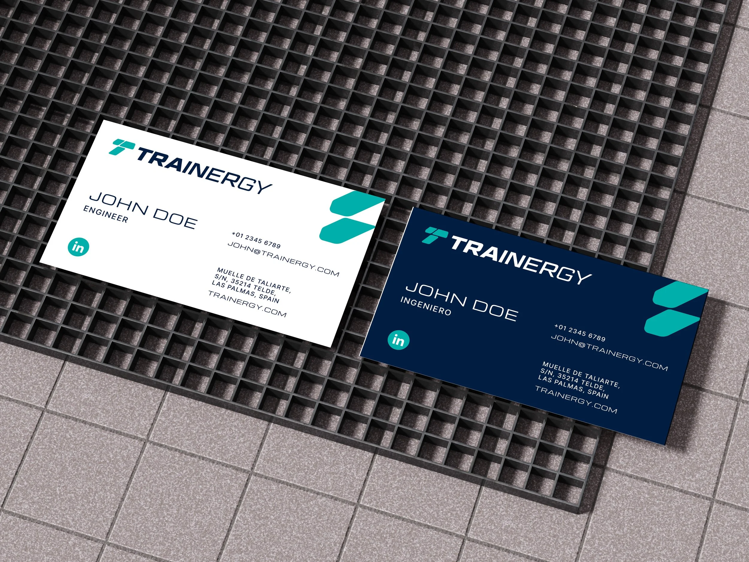
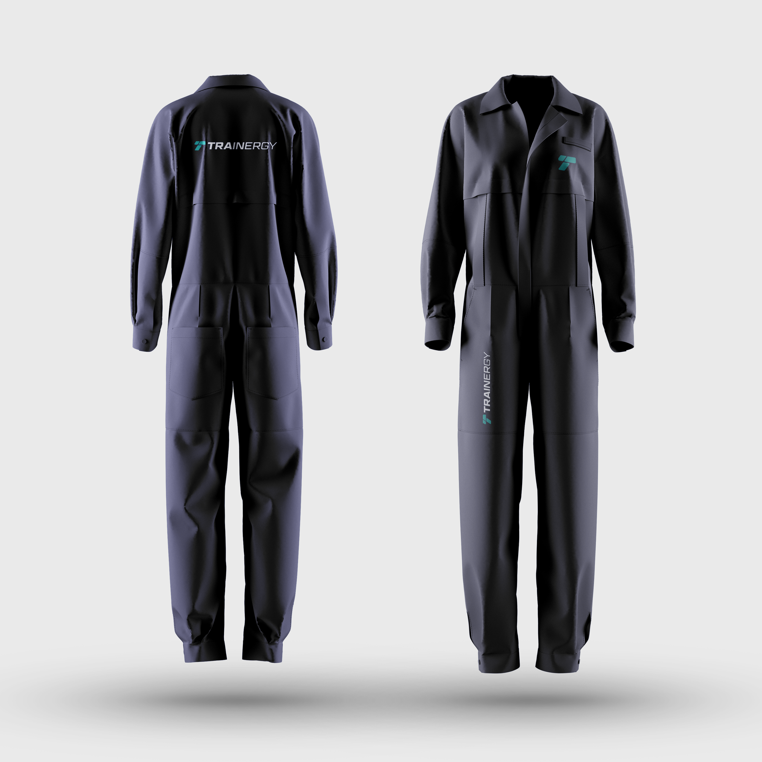
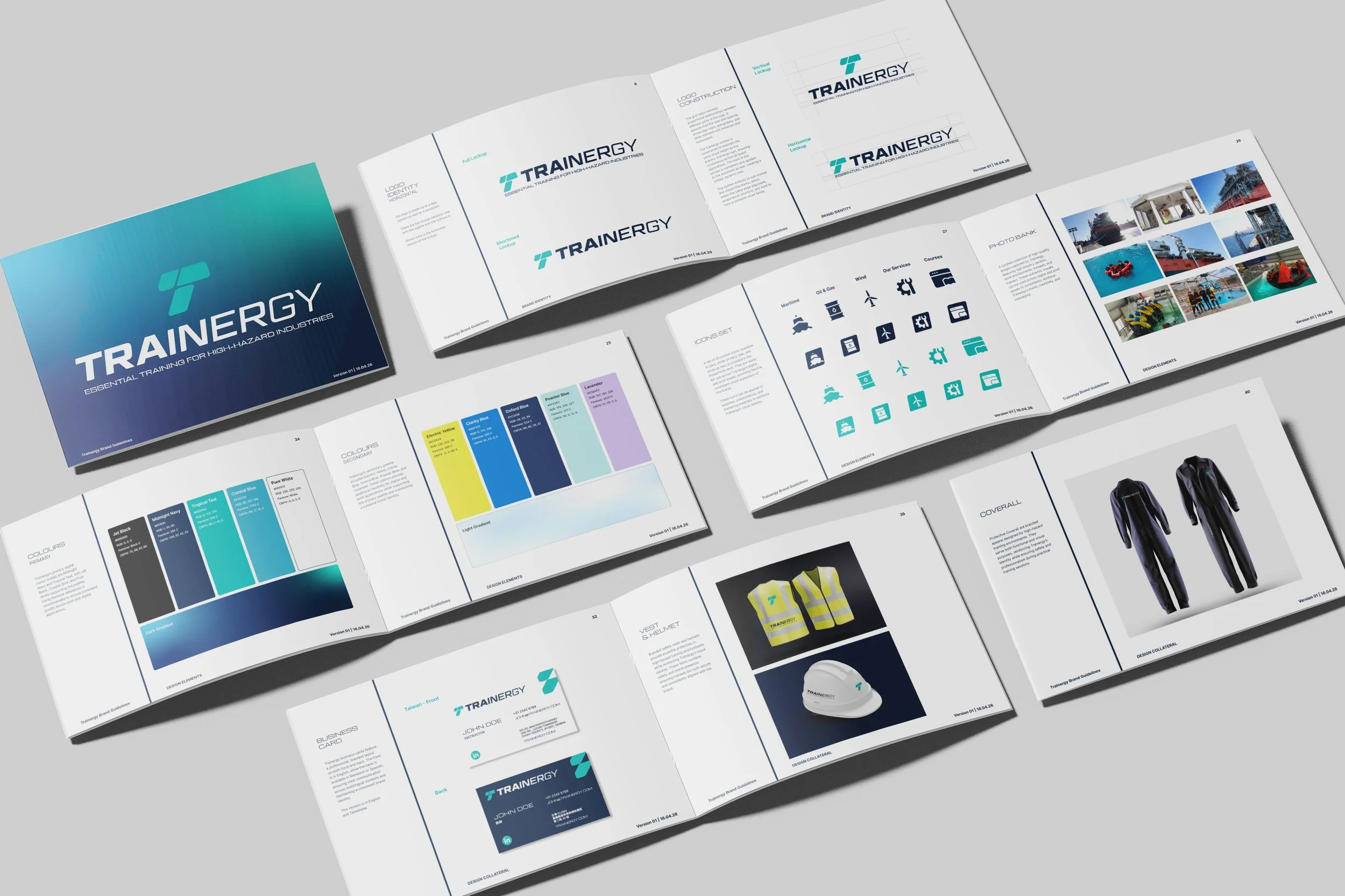
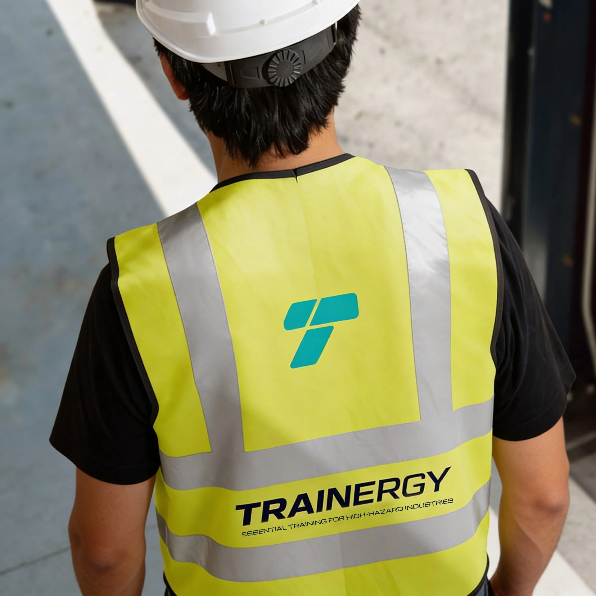
From corporate stationery and brand guidelines to website design, workwear and exhibition graphics, the identity translates seamlessly across physical and digital environments.The result is a confident, scalable brand identity that positions Trainergy as a progressive global training provider, communicating reliability, innovation and expertise across the industries it serves.
Binomial Consulting: Strategic Planning & Brand Positioning | Rehla Design: Visual Identity Suite & Web Design | Tech StrongBox: Web Development | Accessplanit: Booking System Integration | Blinkonomics: SEO Management